Junk Removal Logos: Capture Attention with These Tips
Your junk removal logo says a lot about you and is often a customer’s first introduction to your business. A few simple tips can go a long way in making sure your logo puts your best foot forward.
Use Contrast and Color to Your Advantage
Bright and bold colors are great for grabbing attention and making your brand stand out. However, when used without contrast, these bold color schemes can hurt the eyes and lose the gaze of potential customers quickly. Use contrast to make your key elements pop while maintaining legibility.
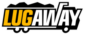 JRA client Lug Away uses a bright, attention-grabbing yellow in its junk removal logo, but contrasts it with black and white graphics to create interest and increase readability.
Keep it Simple
Too many elements can be overwhelming and distracting. By narrowing down the texts and graphic elements used in your logo, you make it easier for customers to process and remember your company. This is especially true when your logo is used in smaller sizes such as the header on your mobile site. Save the tagline for larger graphic prints and keep your primary logo simple.
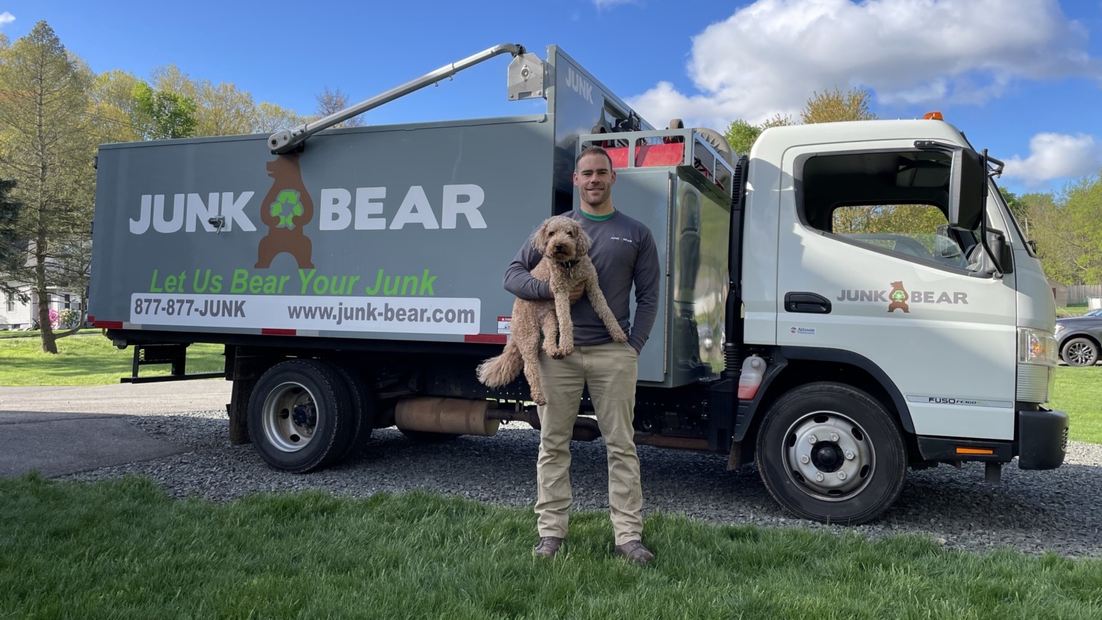
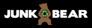 JRA client Junk Bear uses a simple and effective silhouette of a bear holding a recycling symbol to reinforce its name. The bold lettering and contrast draw the eye to its name so it’s easier for clients to remember.
Think Ahead
Try to imagine all of the different ways you will use your logo and take that into account from the beginning. You may need multiple versions of your logo. For example, a wide, horizontal version of your logo may work best on your junk removal truck. But a vertical, stacked version may look better on a coffee mug or ballcap.
Get a Vector File
Be sure to request multiple formats of your finished junk removal logo including vector files such as a SVG, PDF, EPS, or AI file. Vector graphics allow your logo to be resized without losing quality and can be used to generate JPGs and PNGs. Most production shops will require a vector file to print your logo on shirts, hats and to wrap your junk removal truck with custom graphics. Having these files from the beginning will save you a headache later on down the road.
 This tip of the week is presented by Kerri DiNarda, Internal Marketing Specialist at Junk Removal Authority